Wednesday, April 1, 2015

Moore's Law, Cloud Computing and DW/BI

Decision making in today's businesses has become primarily real-time. These businesses need to analyze the information at hand to cope up with rapid changes in the market.


Most companies are taking a steptwards constructing their data warehouse to store and monitor real time data as well as historical data that can be extracted for quick and accurate decision making. It is understood that data warehouse and business intelligence (BI) platforms are complex and create multiple challenges. But, the costs to compute and store with respect to DW and BI platforms has been decreasing exponentially as per Moore’s Law. Before we get into specific cases about how DW and BI industry has changed in terms of Moore’s Law and Cloud Computing, let’s first briefly understand these terms.

According to Moore’s Law:


It is a prediction that was made by Gordon Moore stating that the number of transistors per silicon chip doubles every year.” Whether it be processing power or storage capacity, if something is there on a chip it gets cheaper as per the law. One of the many by-products of storage and computing technology getting cheaper has been cloud computing.

People already use the cloud when they watch movies on Netflix or use Dropbox on their computers or smartphones. Technically, cloud computing refers to an efficient method of managing lots of computer servers, data storage and networking. During the start of 21st century, engineers figured out ways that data and software could be distributed efficiently across multiple computers and their power gathered together for collective usage. These services harness global network of millions of computers, renting and using huge amounts of computing power.

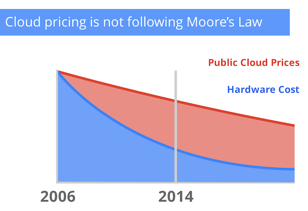
But, contrary to Moore’s law supporting the price drop in cloud computing, Google has observed a slightly different trend. Since Cloud Computing became widely available, public Cloud prices have fallen at 6-8% on an annual basis. When you consider the larger trends in silicon chip pricing over the last several decades, 6%-8% doesn't come close to reflecting the true economics of computing. Over the same period of time, the hardware costs has fallen at 20-30% annually - following Moore’s Law.


But no matter the cost, it is evident that cloud is here to stay and will get cheaper over time. And it has become available to anyone who is able to pay the rent. “The biggest events in the world, the World Cup, the Super Bowl, the big reality shows, all use the cloud” for various online services, said Andy Jassy, the head of Amazon Web Services, or AWS, the largest cloud computing company. The National Aeronautics and Space Administration broadcast the Mars Lander using AWS, and the Obama campaign used it to place a million calls on Election Day 2012. Even part of the Central Intelligence Agency is inside AWS.

These are all examples of how cloud has been benefitting the consumer. But, a lot of changes have come across in the DW/BI space i.e. from the enterprises’ perspective as well. Let’s look at a few specific cases where cheap cloud computing has improved and innovated the use and implementation of DWBI in companies.

The use of Business Intelligence (BI) in the cloud is a game-changer, as it makes BI affordable and easily available as compared to traditional BI. It is expected that customers will slowly but surely migrate from in-house BI to BI on the cloud. Cloud Computing was a big topic of discussion in the early part of 2010 and many vendors developed strategies and solutions around Cloud BI in 2011. Customers have been continuing their shift to the cloud following the trend.

There are several operational and financial factors that work in favor of Cloud Business Intelligence (BI). Primarily:

 Speed of Implementation and Deployment: Immediate availability of environment without any dependence on long delays that are associated with infrastructure procurement, application deployment, etc. This drastically reduces the BI implementation time.
 Elasticity: Leverage the massive computing power available on the Web, scale up and scale down based on changing requirements.
 Focus on Core Strength: Outsource running of BI apps to professionals and focus on their core capabilities.
 Lower Total Cost of Ownership: Transform significant amount of the invested capital expenditure to operational expenditure.
 On-demand Availability: Support mobile and remote usage, browser-based access to control everything from the cloud platform to database management, from the data warehouse layer to the analytics platform.

Oracle BI on Cloud

Oracle recognizes the importance of the business intelligence systems in providing insights and improving the quality of deicion making. Business Intelligence remains a key investment area for Oracle and Oracle is investing heavily to bring cloud ready BI software to solutions.

Xactly Corporation is a leader in SaaS based sales compensation management software. Over 125 companies and thousands of users across the world use Xactly's solutions every day. Xactly is using Oracle Business Intelligence to deploy an analytics solution that helps customers track and analyze what they have sold, to whom, where, through which channels, and at what discounts. The analytics application provides out-of-the-box dashboards for common functions, such as sales incentive analysis, sales performance analysis and product performance analysis reports, and dashboards that work immediately without any customization or configuration. Oracle Business Intelligence helps Xactly deliver advanced reporting capabilities as well as dashboard creation tools that help end users gain value much more quickly.

The ability to scale to a broad user base, intuitive dashboards and reports, metadata based design, multi-tenant support, ability to access multiple data sources via a single, common metadata layer were cited as some of the reasons why Xactly choose Oracle BI to power analytics on its SaaS platform.

Customers and partners have also deployed Oracle BI applications, Oracle's purpose build pre-packaged CRM and ERP analytical applications on the cloud. One such example is the solution offered by Step Ahead Solutions, an Oracle partner. Step Ahead's try-before-you-buy On-demand Lab is a unique offering where prospect clients are able to rent out solutions, run trials, and explore the capabilities of Oracle business intelligence before making a decision to buy.

This shows that high availability of cloud technology has helped companies used Business Intelligence tools in a highly scalable, manageable, configurable, extendable and easy to use manner.

Wednesday, March 4, 2015

Presentation and Visualization Methods

Due to the rising amounts of data that is being generated today, it is being called the new currency with the Internet being the exchange bureau through which data is being traded. Data is everywhere, from telephone bills, to labels on food packages to location services. Due to this abundance of data, it is becoming increasingly difficult for the designers to present data in a sense that it stands out from the competing data visualizations.


The best way to quickly draw customers’ attention to key information is by the use of good visualization techniques. By presenting information in a systematic manner, it is also possible to uncover patterns and observations that are initially not apparent by looking at the statistics.

Consumer behaviour and expectations differ significantly for different industries. For instance, the way a financial organization might use data visualization techniques for its customers will differ from what inventory management visualization might present.

 For the purpose of this blog, we will take into account three lines of business vignettes stated below and discuss the optimal methods and their illustrations for data presentation and visualization.

Order Management


The basics of supply and demand are prevalent in every industry. The customer places an order either in person or through a digital medium. Data visualization techniques might not come as handy in case of in person purchases as they would in the case of digital purchases. 
Since the dawn of e-commerce and online shopping, the online delivery system has improved significantly. The details that are usually provided to the customer include:
Shipping address
Billing address
Payment method
Item cost and amount
Total amount paid
Item description
Tracking information

Once the customer finalizes the purchase, they review order details a couple of times and then rarely look back at it. What they do keep a check of is the tracking information.
Since the above information is important, it should be clearly readable to the customer specially the shipping address and grand total. Additional features can be incorporated as and when needed without providing too many distractions.


Looking at the tracking information, there can be a few ways to present it.
Provide the tracking information in a text format
Use a progress bar to give a visual overview
Use other visual aids like a highlighted text, pyramids and so forth (Recommended)


It’s evident that the progress bar shows a way more simplistic yet effective way of displaying the tracking information. When you click on each dot on the bar additional information is shown regarding the whereabouts of the package.

E-Commerce


One of the ways visualizations tools come in handy in electronic commerce industry are to display website analytics. This means information related to the people visiting a particular website.
For most part of the last decade, online statistics were very confusing. Since the inception of Google Analytics though, things have changed. Earlier the analytics data was chunky to obtain, difficult to parse and the tools that were made to serve those who hosted websites and not the average consumer or blogger. One of the most popular tools used to be Urchin.

These days, there are some really amazing tools being developed with respect to the user experience field. The best way to represent data for such tools can be:
Giving text based information of the number of visitors from different websites along with the reference URLs
Display information using pie charts, bar graphs and line graphs to show the visitor information
Use a world map as a reference to visually show the distribution of visitor information according to countries, states, or cities

Google Analytics is the best tool to show website visitor information. Since Google shows so much information about the visitors, it uses a combination of the various methods listed about to best convey the information.  But, lets look at another tool called Woopra, which performs similar analytics functions, but displays data in an efficient manner with more focus on who is using the website.


As can be seen from the dashboard, a combination of line graphs, tag clouds, world map, and other textual information is used to clearly represent different types of information. The number of visitors for a given time period based on different conditions are represented as line graphs here. This is much better than using bar graphs as it shows a trend of the visits.

TRANSPORTATION


As an example, we will be considering the airline industry since it has become the most popular mode of intercontinental transportation. Consequently, air travel is also more expensive than other modes of transport. Airlines invest significant amount of money to give their customers a pleasurable experience in using the services. One of these services is providing the customer with all the pre-flight and tracking information. 

The type of information and way it is presented to the customer varies based on the airline segment. Low cost airlines don’t invest as much on such services as compared to the premium segment. But, some things have become standard affairs while displaying such information to the clients. For instance, flight status for any airline is now displayed in a graphical format. Possible ways to convey this information can be the following:
Display the time and date of the flights along with the current status whether its on time, delayed or currently flying
Use a progress graph to show flight status. If the flight is currently in the air, it shows the information graphically (Recommended)

The recommendation would be to graphically show the flight status. These days’ consumers don't have the attention span to actually concentrate on the smaller details. Giving a graphical overview as shown is both a more sophisticated way of displaying information as well as is easy for the consumers to comprehend. 


For the purpose of understanding presentation and visualization of data in each of the industries, appropriate examples show how different ways can be employed to serve the purpose. There can be numerous ways of visualizing data, but that depends on the industry and organizations’ requirements. Considering the amount of information that the customer requires today, a combination of different visualization tools should ideally be used.

References:


http://guides.library.duke.edu/vis_types
http://www.creativebloq.com/design-tools/data-visualization-712402
http://www.rinhoo.com/helpItem.php?id=16
http://abetteruserexperience.com/2012/05/ux-tool-review-woopra-visitor-oriented-analytics/
http://www.searchenginejournal.com/9-google-analytics-alternatives/92071/


Wednesday, February 18, 2015

Big Unstructured Data v/s Structured Relational Data

Data warehousing has become an essential part of any organization in today’s world. To understand data warehousing we first need to understand what databases are as the warehouses are usually based on these databases. The data warehouse is then used for the various analytic and reporting purposes. But, before we talk about data warehousing, lets look at the kind of data that organizations generate these days.


There used to be a time when only structured data was used for storage and performing analysis. But, as technology exponentially grows in every manner, getting valuable information out of unstructured data has also been the norm these days. We will discuss how to get useful information out of the unstructured data, first lets take a look at the difference between structured and unstructured data.

Unstructured Data


One of the most common ways of filing data is storing it in an unstructured form. When some data is called unstructured it does not have an identifiable structure associated with it. Unstructured data is described as the data that can’t be stored in rows and columns in a relational database. An example of unstructured data can be a document that is archived in a file folder or even images, audio and video.

Structured Data


Structured data refers to the type that follows a predefined schema for storage. For instance storage of fully structured data can be called a relational database system. Designing a database schema is a whole different process in itself. It requires the database designer to define the schema using the type and structure of data and its relations.  The basic purpose of having a well-defined schema for storage of structured data is the efficient processing of that data and ease of navigation through the database.

Comparison


So, based on the brief descriptions of both the types of data it can be seen that one apparent advantage of using unstructured data is that there is no extra effort required for its classification. Whereas, in case of structured data, first a well-defined schema needs to be put in place.  But, on the other hand it’s a lot easier to navigate structured data as compared to unstructured data. Unstructured data is highly flexible in its nature as well as comparatively more scalable.

There is also something called semi-structured data. This type of data doesn't require a predefined schema but it is possible to make one.

Data Warehousing


We know that a data warehouse is used for OLAP instead of OLTP as in the case of databases. A data warehouse primarily consists of aggregated historical data that is optimized for specific types of analysis. What is going to be stored in the data warehouse is dependent mainly on the client/user requirements. What the user wants to view at the output and at what levels of aggregation determines these requirements.

A typical data warehouse stores the following types of data:

Historical Data
Derived Data
Metadata

Historical Data – An organization typically stores several years of historical data in their data warehouses. Factors such as storage infrastructure and analysis required to meet the client requirements determine the amount of that historical data that is made available. The source of this kind of data can be transactional database archives among other sources. Summary data is also based out of historical data and most of the data in an organization revolves around this data type. Transactions make the major chunk of the volume of data for an organization. 

Derived Data – This type of data is generated from existing data usually by using some data transformation technique or mathematical operation. Usually when it’s required that we increase the response time of a query or for database maintenance operations, derived data is put in use. The volume of such kind of data depends on the requirements. If performance is of key importance and there needs to be lots of information derived from existing data, then to save processing time derived data can be used.

Metadata – Data that describes stored data and other schema objects is called metadata. This type of data is also used by applications to access and compute the data properly.

All the above listed types of data are stored in a data warehouse, which is modeled based on the given requirements. When it comes to analysis, the primary purpose of a data warehouse is to support strategic decision-making.

Doing analysis through transactional systems there used to be several issues with respect to the speed of queries, linking tables from separate systems and so forth. The purpose of a data warehouse is to specifically addressing such issues.

In a data warehouse, all the data is centralized
A data warehouse is designed to ease query writing and optimize the reporting speed
The linking of tables from different source transactional systems is facilitated by the key fields that are created by the data warehouse during the addition of new records
Talking about derived data, it is stored at different levels of granularity. This can easily be rolled up to match the granularity of other data warehouse tables.

Limitations of using Data Warehousing


Considering all the advantages that data warehousing provides there are certain areas where it lacks in providing service to the user. Some of these disadvantages are listed below:

The data must be cleaned, loaded and extracted in order for it to qualify for storage in a data warehouse. This takes up most of the effort put in building a data warehouse at the first place.
Proper training needs to be provided to the employees who use and maintain the data warehouse due to user variability
Since a data warehouse is incongruous among systems, it is usually quite difficult and complex to maintain.
A significant disadvantage of replicating data for use in a data warehouse is that the data contained in the warehouse might become inconsistent with the original sources. The updates are usually held periodically, and if the analysis being done requires the most recent or currently available information then it may not provide the most accurate results.

So when a client’s needs are unpredictable, a data warehouse might not be the best approach to the solution.

Data Warehousing & its Future


Today’s business problems are becoming more complex than ever. This necessitates the development of better business intelligence and data warehousing tools. Lets look at some of the promises and challenges that data warehousing holds for us in the future:

Real-time data warehousing: Data warehouses updated their data on a periodic basis. This leaves some time when there is old data in the warehouse compared to what the operational system holds. Real-time data warehousing means that the rate at which data is made available is more frequent. Almost as frequent as near-real-time update of the data can be possible where data latency typically is in the range of minutes for instance.

Software as a Service (SaaS): When using SaaS by deploying IS applications, the provider licenses its applications to customers for based on the service being used based on the demand. Finding SaaS based software applications and resources that meet specific needs and requirements can be challenging. Software’s are becoming more agile by the day, and this provides significant boost to the appeal and actual use of SaaS for data warehousing.


Cloud Computing: This is the newest trend in the market right now. Although, it is fairly established for operational applications today, there is not much use of cloud in the data warehouse platforms as yet. Clouds have the ability to provide dynamic allocation, which becomes helpful when data volume of a particular warehouse varies fairly unpredictably. This also makes planning the capacity of the warehouse difficult. Also, through cloud, the IS applications can significantly scale up based on the requirements.

Monday, February 2, 2015

Business Intelligence and Analysis Products Scan and Evaluation

Overview 

Companies across industries have been continuously gaining interest in using Business Intelligence to gather information for corporate analysis from collected raw data. Based on the market demand for sophisticated business intelligence tools and applications, there are numerous vendors that provide excellent BI (Business Intelligence) tools for corporate usage. 


Choosing a BI tool for the firm, one needs to take various criteria into account before making an investment. Factors such as the type of the company, size of the company, technical requirements and so forth must be individually considered to make a good decision. One more thing to keep in mind is the type of information one expects from the data and the tools. Due to the fact that there is a presence of several big competitors in the BI tools market, making such a choice can get difficult.

BI Industry Market Share 

Currently, there are many major players in the market such as SAP, Oracle, IBM, SAS Institute, Tibco Software, Tableau and so forth. Depending on the vendor, shown below is the market share of each major player as of the end of 2013. 

Source: http://timoelliott.com/blog/2014/04/gartner-bi-analytics-market-shares-2013.html

Five BI Tools 

Taking into account all major players in the market, for the purpose of this article five products are being considered based on differences in certain criteria i.e. SAS BI, Oracle BI, Pentaho BI, Yellowfin BI, and Jaspersoft.

Comparison Criteria Used & Analysis 

While choosing a BI tool for corporate usage, there are several factors that need to be taken into account. Most of these factors depend on the type of firm and its employees for whom the application is of interest.  For academic purposes though, five measures are being taken into consideration that should act as primary filters while making such a choice. Following are the five measures along with their narratives that make up the primary filter: 

Productivity: This criterion defines how effective are the outcomes of the effort put in using a BI tool. 
Core Functionality: A BI tool these days comes with many offerings. This criterion is based on the breadth of these offerings.
Uniqueness: With a plethora of BI tools available in the market today, each vendor needs to be able distinguish their offerings from the competitor's. This criteria measures the tools based on their uniqueness of offerings. 
Cost: How cost effective the tool is. This basically compares the benefits versus the cost. 
Ease of Use: A firm needs to be able to get the most out of a tool with minimum input and training. Ease of use defines the ability of the tool to be used by employees without much hassle.

Comparison Table 

Based on the stated measures a comparison table is shown below that states the weightage that has been given to each criterion as well as the ratings of each BI tool for the same.


Yellowfin BI 

Using Yellowfin BI firms can report on and analyse collected data to generate useful insights about various business operations. The primary goal of Yellowfin BI is to make use of BI tools easy. 

Productivity: Yellowfin dashboards are vastly interactive with the ability to drill down through to meticulous information. Another notable feature that makes this tool so productive is its interactive filtering (include only certain products or regions for example). 

Core Functionality: Yellowfin offers more functionality within the platform other than the usual ones, such as connecting from data sources on the fly, drill anywhere within the data, and advanced calculations. It has over 50 data visualizations for users to choose from. 

Uniqueness: A unique feature about Yellowfin BI is that it focuses heavily on mobile and collaboration functionalities, providing users location intelligence for viewing and drilling data into maps to gain better context and make smarter business decisions. 

Ease of Use: The tool sports a storyboarding facility that allows users to combine reports with text and graphics to produce easily communicated visuals. Users are typically protected from the ugly technical details of data access, and a Meta data layer means that a user can access data in a format that is friendly and more useful. 

Cost: Yellowfin offers a single all-inclusive per user per annum subscription-licensing model – software, maintenance, support and upgrades are included. There are no catches or add-on licenses to contend with. Yellowfin offers a 5-user license starter pack coming in at $3,000 per annum.

Pentaho BI 

Pentaho is broad enough to meet most needs, and is best summarized as a ‘good all-rounder’ – something that will be attractive to business managers who simply want to get a job done. Along with the broad array of analytics tools that address BI, Pentaho also provides predictive analytics and data integration. 

Core Functionality: Pentaho offers powerful visualizations that allow users to interact with their data, zooming in and looking at important statistics. A more noteworthy feature is its data integration software, which can blend information together from unlimited sources, including NoSQL, Hadoop, relational databases, and analytical databases. 

Uniqueness: Pentaho has many unique abilities such as powerful visualizations, geo-mapping, heat grids, and scatter charts. This helps cater to specific customer requirements at times when other tools seem to be of little use. 

Productivity: The Pentaho system relies on in-memory data caching, which provides analysis of data as fast as one can think, making for a vastly quicker BI tool. This tool can also cater to the organizations that don't have fancy reporting requirements with web-based reporting. 

Ease of Use: It is very easy to build an ETL pipeline after the initial learning curve. The reporting solutions along with visual analysis and dash-boarding tools are considerably easy to use. 

Cost: In the world of open source Business Intelligence tools, it is the frontrunner. This open source lineage means that there is a free community edition available for use (no support and training). This also makes the solution cost-effective.

SAS BI 

It is a package of various technologies and solutions that address features such as statistics, business intelligence, data mining, predictive analytics, machine learning, and a number of vertical and horizontal business solutions. 

Core Functionality: BI offering comes with all the usual features, with added bonus of a broader analytical capability. Data visualization, reporting, ad-hoc reporting, self-service BI, collaboration and mobile BI are all available and compare well with others.

Productivity: On the other hand SAS is not likely to be the most productive analytics environment. It is complex and this of course is the shadow cast by the sophistication it offers. 

Uniqueness: Visual Analytics in SAS includes features that are unique in the BI world, including its integration of powerful, advanced analytics directly into a BI tool. 

Ease of Use: The learning curve and breadth of knowledge is very large. It takes a while for a user to become proficient with SAS and the training tools. 

Cost: Keeping the above points in mind of the tool being complex and having a significant learning curve, it is best suited for large firms. But for the price it’s the best there is.

Jaspersoft 

Jaspersoft is a solid, widely used product set, that delivers a no frills BI environment and will meet the needs of most organizations with ease. All the usual functionality is included – reporting, dashboards, analysis and data integration. 

Core Functionality: Dashboards, visualizations, rich analytics including a web-scale platform, and self-service reports are just a few of the capabilities supported by Jaspersoft, which can be easily embedded in both internal and commercial applications. 

Productivity: This system includes a report scheduler that allows users to manage distribution of reports across a company. In-memory analysis capabilities support the system's ability to process complex analytical queries quickly. 

Uniqueness: One of Jaspersoft's most notable features if not so unique is its reporting ability. Their reporting tools draw data from multiple places and display it in a simple, straightforward, interactive way for users to analyze and draw insights from. 

Ease of Use: A variety of services make the environment fairly easy to use, once they have been set up they look after security, metadata and scheduling activities. 

Cost: Over all it provides a reasonably priced, effective environment to develop and deploy BI applications. It does what it needs to do without a great deal of fuss.

Oracle BI

For existing Oracle customers this tool will be of greatest interest due to its fairly expensive and proprietary nature. For such customers, the functionality and architecture presented by Oracle can be enormously beneficial. 

Core Functionality: The Oracle BI Foundation Suite encompasses reporting, dashboards, ad-hoc analysis, multi-dimensional OLAP, scorecards and predictive analytics in one integrated platform. The data visualization capabilities compare well with other products and include recommended visualization for specific data. 

Productivity: For the firms who follow the Oracle mantra, OBIEE can do wonders. The BI Foundation Suite merges all of Oracle’s eight BI platforms. Out of which one of the benefits of Oracle's Exalytics component is that it can analyze large sets of data in a short time. 

Uniqueness: Along with superb integration of Oracle services, the BI Suite is one of the few on the market that provides excellent Big Data capability. 

Ease of Use: Oracle operates under a very dated architecture. This means the interface is not very smooth and complex features not very well handled. Companies seeking to customize the software or to make upgrades will need to make a substantial investment of both time and capital. 

Cost: For big time Oracle customers OBIEE provides considerably lower costs and more functionality. For others it would be significant investment of both time and money as stated above.

Best from the Rest 

Based on the above multi-criteria analysis, it can be said that Yellowfin BI turns out to be the best overall BI tool. But, every firm has specific requirements and based on that the factors also differ significantly. Hence, the choice of a tool really depends on the business model as well as project requirements that the firm is engaged with.